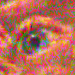
This was my first fine art print done with screenprinting, and also my first print done with my newest color technique which no longer relies upon RGB or CMY but can use any arbitrary set of colors. I thought some people would find it interesting to see the steps I went through to create such an image. Click here to see the finished print. I first started with a photograph I took of an eye.

I took that photo into Krita and painted on-top, exaggerating colors and completely replacing the iris and pupil. The idea was to make something that would work well with the halftone, and I arrived at this:

From there I needed to find a good pattern to use. I wanted this to look as psychedelic as possible, so I kept thinking I should use the Mandelbrot set. The problem with using the Mandelbrot set is that it's not possible to control the shape of it, it just is what it is, so it requires searching around for a suitable pattern. But I had seen eye-shaped regions during prior excursions through the fractal, so I was confident that I'd be able to find something that would line up reasonably well. I have written my own Mandelbrot explorer and I included a function to allow me to overlay an image as I'm navigating. Using the eye as an overlay, I was able to find the following image which fit reasonable well with the pupil, iris, and eyelid. It's been a couple years since this stage but I think this might have something to do with why I redid the iris, perhaps to better fit the pattern.

If you are curious about the Mandelbrot set and want to know more, or you are already a fan of it, check out the Mandelmap poster that I self-published.
You can render the Mandelbrot set by coloring pixels according to how fast they escape, in this case brighter pixels mean that they escape faster. I then ran contours along this gradient, and I used a special processing technique which I developed myself to force those contours to be apprpximately equally spaced so that I could use them effectively for a halftone. My first version of this eye looked like this, which is an RGB halftone:

It looks pretty cool animated, but when I tried to make a version for print it just either didn't look enough like an eye with actual flesh tones because the lines were too big or it started looking muddy because the lines were too small. Also it had details I didn't like but my RGB halftones are very difficult to paint by hand because of the way the colors overlap. I set it aside for a few years, until early 2018 when I made a huge breakthrough in the way I halftone colors. The colors could now be hand-picked and sit next to eachother without overlapping. With this new coloring method, I was able to get this:

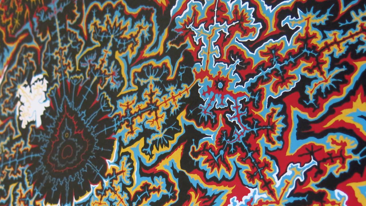
The pattern is just as visible as in the RGB version, but the colors are less distracting and so the eye looks more "real." And the best part is that I knew this coloring method would work well for screenprinting. I rendered it at a large resolution and when I zoomed in close I saw similar problems as before, but this time I felt confident in my ability to fix them. I paint at least somewhat over most of my halftones, but this one was extreme. I painted over every inch of it twice, taking over 100 hours. I would keep thinking that I was close to done, but when I would fix one area suddenly I would notice another area that was off. I made sure that the details looked great, adding flames, branches, minibrots, and even a couple little people. Here's some timelapse footage of just a tiny portion of all that painting:
Zooming in and doodling around with shapes is easy enough; it's improving the look of the eye in the process that's difficult. So as I was shaping the details I was constantly thinking about the impact it would have on the illusion and which way I needed to push things. How much blue do I need here, how much lighter should I make this area, how can I define this crease, etc. Below is an example, with the algorithmic output on the left and the painting on the right.

The most daunting part about finally going to print was making sure that I selected a proper ink for each color. There is no such thing as a perfect computer representation of a printed color, so I made my final decisions based mostly on how the ink colors looked relative to each other. Playing with it in the computer, it was easy to throw the whole image off if even one of the colors was too vibrant or too dull. But I'm super happy with how the final colors came out looking! Industry Print Shop did a great job working with me to get the colors just right, and the print quality is phenomenal. The last two pictures below are photos of the actual print, click either one to be taken to the purchase page if you'd like to buy one.


Comments (4 Responses)
Radam
I’ve paused many a bike ride to admire your work. Decided to get a print today for those rainy (or too hot) days. This page sold me. Been into fractal art a long time and really dug seeing your process. Peace!
ppvecftohf
Muchas gracias. ?Como puedo iniciar sesion?
Amanda
Fascinating. Though I must admit that some of it seems written in a foreign language. In the sense that my mind can’t quite grasp the process, not referring to your writing skills.
22 July, 2022
matt
Absolutely inspiring work that has engaged me for many years. I’m thrilled to own a signed print and only recently came across this wonderful writeup of the process. I hope you do more prints!